
Today is the 36th day of the year. That may not seem like much, but as the day winds to a close, so does the first 10% of the year. With one-tenth of the year in the taillights, it would be a great time to take a few minutes a do a self-check of where your business is at. Are you on track towards meeting, or hopefully exceeding, your year-end goals? Are you attracting new clients? Do you feel like your website has become stagnant and outdated?
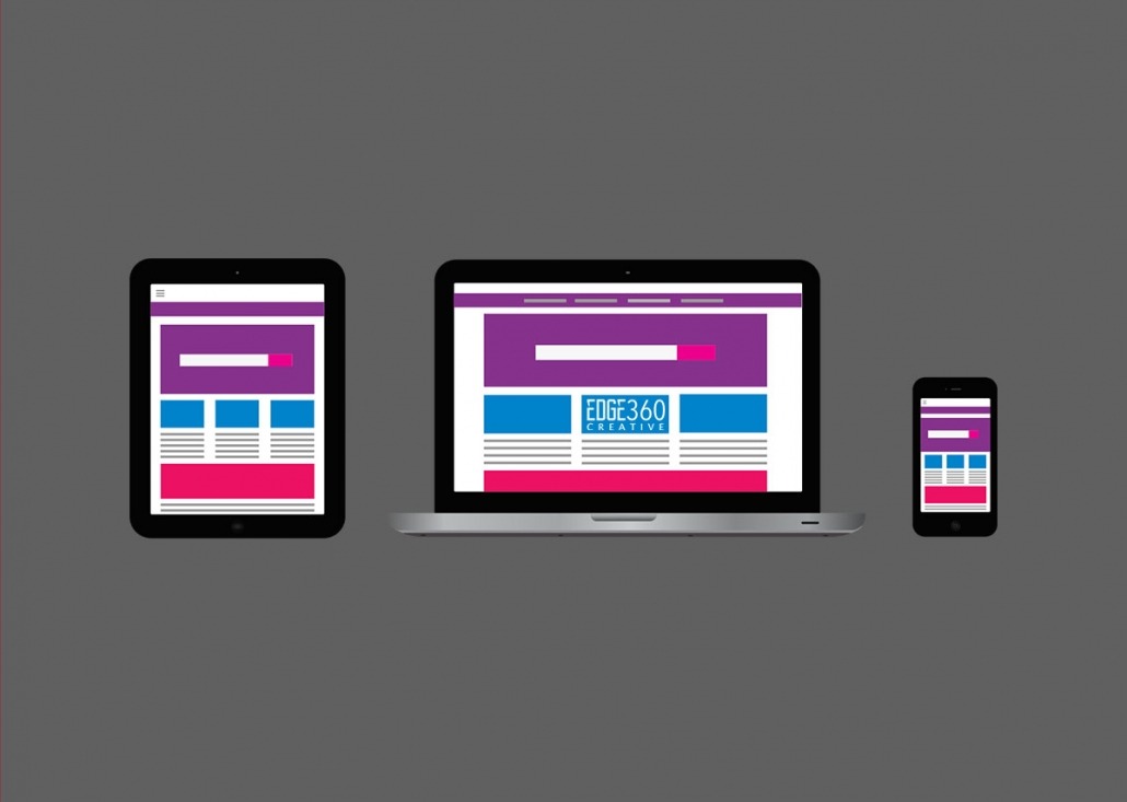
Ponder this question; is your website design optimized to meet mobile client demand? It is currently estimated that 4 out of every 5 Americans have a smartphone. With almost 80% of Americans carrying a smartphone every day, it is more likely that a potential clients’ interaction with your website will either first occur or entirely occur on a mobile or tablet device. Your website needs to be responsive, meaning it adjusts automatically to render properly on any size screen or device. Responsive website design is an approach used by web designers to configure a website to “respond to” or resize itself depending on the type of device being used to view it. This is essential for anyone with a digital presence. With the growth of smartphones and mobile devices, more people are using smaller screens to view websites.
Mobile client demand. Are you ready? Is your site ready? Take 5 minutes today to open up your site on your mobile device. Do you like what you see? If not, contact us to discuss options on how Edge360 Creative can help give you the edge in the growing mobile-first environment.
Want more tips and how-to articles to help take your business marketing to the next level? Please subscribe to get future editions of our newsletter, “The Edge.” Stuff you need to know, delivered once a month. No SPAM, no bull, unsubscribe at any time. Sign up at http://eepurl.com/gdjrIj.